How to send personalized mass emails in Gmail using Apple Script?

How to send personalized mass emails in Gmail using Apple Script?

How to send personalized mass emails in Gmail using Apple Script?

[wpseo_breadcrumb]

Personalized mass emails is possible using any mail server such as Google or Yahoo. Moreover, it is possible to use any mail clients like Mac Mail and Outlook. Unfortunately, since we are using Apple Script, this guide is for MacOSX users only.

To automate the emailing process of multiple accounts, we need the following:

1. CSV file with a name and email field
2. The Apple script, .scpt extension
3. Mac Mail

Create the email list in CSV format

So first build your email list…
In the first column, add header firstName and on the next column add eAddress.

On the first column, enter a name followed with a “,”. Example “Anna,” (Do not include the parenthesis). Also, add the email address on the second column.
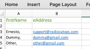
Frist name and email add

The Apple Script code

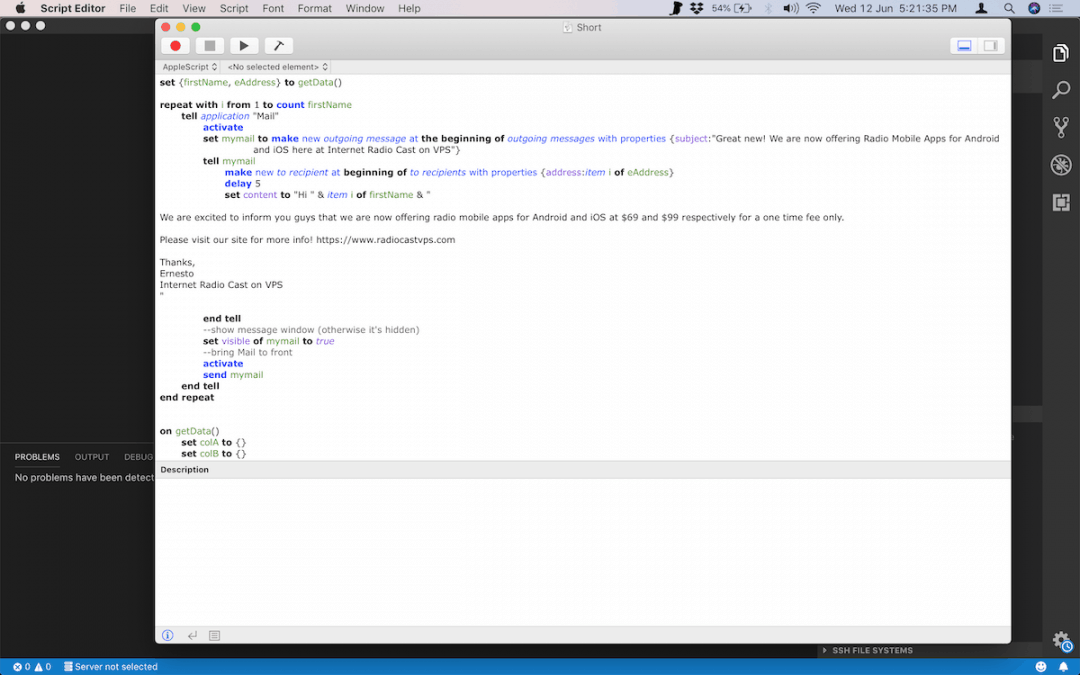
Next is to add the Apple Script. Open your Script Editor (type in apple script in spotlight) then add this code. You can also copy the code at Gist Github.

[css]set {firstName, eAddress} to getData()

repeat with i from 1 to count firstName
tell application "Mail"
activate
set mymail to make new outgoing message at the beginning of outgoing messages with properties {subject:"Great new! We are now offering Radio Mobile Apps for Android and iOS here at Internet Radio Cast on VPS"}
tell mymail
make new to recipient at beginning of to recipients with properties {address:item i of eAddress}
delay 5
set content to "Hi " & item i of firstName & "

We are excited to inform you guys that we are now offering radio mobile apps for Android and iOS at $69 and $99 respectively for a one time fee only.

Please visit our site for more info! https://www.radiocastvps.com

Thanks,
Ernesto
Internet Radio Cast on VPS
"

end tell
–show message window (otherwise it’s hidden)
set visible of mymail to true
–bring Mail to front
activate
send mymail
end tell
end repeat

on getData()
set colA to {}
set colB to {}
tell application "Microsoft Excel"

activate
tell active sheet
set lastRow to first row index of (get end (last cell of column 1) direction toward the top)

repeat with i from 3 to lastRow
set end of colA to (value of range ("A" & i))
set end of colB to (value of range ("B" & i))
end repeat
end tell
end tell

return {colA, colB}
end getData[/css]

Then customize the following, in order to have your custom message.

1. subject:
– In between ” “, you can insert your subject. Example, “My Subject ”

2. Time delay
– Default delay is 5 seconds… This means that every 5 seconds, the script will send an email to each one. You can adjust this to your preferred time.

3. Greetings
– In the set content line, you can add “your custom greeting here ” instead of “Hi ”

4. Message
– On the example above, change the message from We… and ends on VPS to your custom message. Leave the character ” under and must not be modified.

Remember, personalized names are predefine in the CSV file.

Open Mac Mail and start sending personalized mass emails

Once you have the code set up properly, you can now start the automatic process of sending emails. You can do that by following these steps:

1. Open the CSV. And make sure no other CSV files are open.
2. Open Mac Mail. And make sure you have chosen the correct (sender) account.
3. Now go to your Apple script and click the play button.

After that, you can just sit back and relax while Mac mail send all the messages for you.

How to Submit a Ticket?

How to Submit a Ticket?

How to Submit a Ticket?

[wpseo_breadcrumb]

Do you know how to submit a ticket already? If not, then it’s good news to our customers, getting help is made even easier here at Internet Radio Cast on VPS.

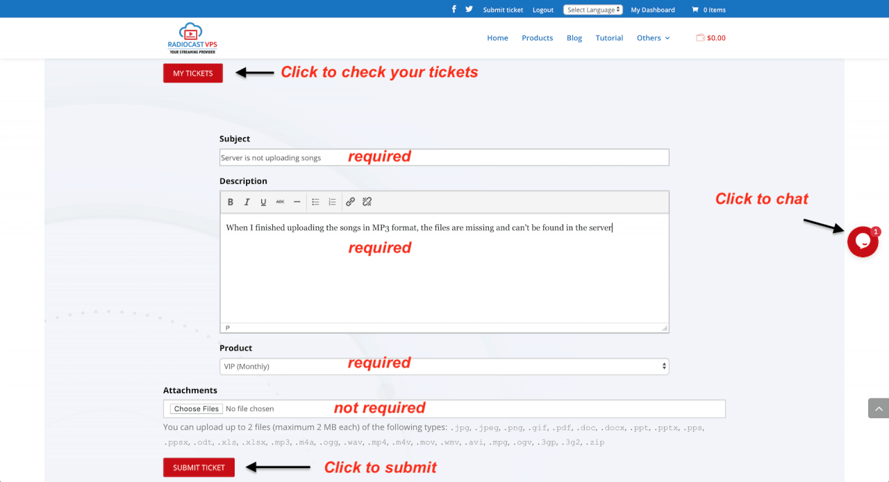
If you have any concerns or inquiries, you can always contact us via chat (the floating bubble). However, in such times, the chat support is unavailable and/or problems need to be monitored daily. For that reason, we provide a new form of communication. And that is the use of ticket form submission.

So how can you submit a ticket properly?

1. On the secondary navigation located at the top right, click the submit ticket menu.
2. As a result, this will then redirect you to the submission page.

  • While on the page, enter your credentials and log in.

While on this page, you can also check all your previous tickets. Just click the “My tickets” button on the top left.

3. Also in the form, add your subject and briefly explain the problem and why you need help. And then, choose the product you needed help.

  • All 3 fields are necessary.
  • The 4th field which is uploading of supporting documents is not necessary. However, it is essential to understanding the issue.

4. Finally, click the submit ticket button to send your concerns to our support team immediately.

Upon receiving your request.

  • Certainly, replies will be in less than 24 hours or as soon as possible.
  • Even more, investigation of the issue will start immediately.

Also take note that the deletion of images will take effect immediately, once tickets are closed.

Thanks to Awesome Support for providing this plugin.

Toggle pricing table using a slider button

Toggle pricing table using a slider button

Toggle pricing table using a slider button

[wpseo_breadcrumb]

To begin with, the toggle pricing demonstration will be using DIVI’s pricing tables module which is basically HTML and CSS. Therefore, the overall concept will be similar to any theme you will be using.

Now to implement the pricing table from month to year, I followed, but not all, this Facebook live instruction.

So here’s the step by step guide on how I made it.

First of all, create the toggle pricing tables

First is to create the monthly pricing table and add a class name “month”.

  • In this case, I created 3 different pricing tables instead of just creating one and add 3 elements like in the Facebook demo.

Secondly, I duplicated all the monthly pricing tables and add a class name “year”.

  • Edit the tables and add the annual prices and product links.

Moreover, on the DIVI’s Section where the pricing tables are located, add an ID name “toggle-tables”.

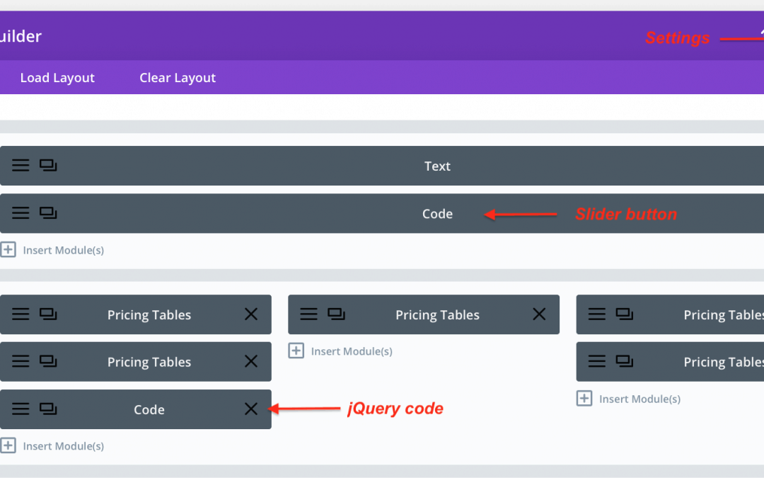
Next, is to add some of his CSS code locally on the Settings (same page – top right, see image below for visualization).

[css]/* Toggle price structure */
.toggle-tables .year.et_pb_pricing {
position: absolute;
top: 0;
width: 100%;
z-index: -1;
}

.toggle-tables.annual .year.et_pb_pricing {
z-index: 1;
}

.et_pb_column {
position: relative;
}

.toggle-tables.annual .show-monthly {
display: block;
}

.toggle-tables .show-monthly {
display: none;
}

.toggle-tables .show-annual {
display: block;
}

.toggle-tables.annual .show-annual {
display: none;
}
[/css]

Secondly, create the toggle pricing slider button

Once the tables are overlapping each other, we’re now done with Facebook live from Divi Space. And it’s now time to create our slider button.

On top of the pricing tables, first, add a new row and insert a fullwidth code module.

In addition, add this checkbox type input with the corresponding classes and click save.

[sourcecode]
<label class="switch">
<input type="checkbox">
<span class="slider round">
<span class="show-annual">Monthly</span>
<span class="show-monthly">Yearly</span>
</span>
</label>
[/sourcecode]


Also, on the Page settings for CSS, insert this code:

[css]/* slider button for toggle pricing */
.switch {
display: inline-block;
height: 34px;
min-width: 60px;
position: relative;
vertical-align: middle;
}
.switch .slider {
background-color: #e02b20;
bottom: 0;
color: #fff;
cursor: pointer;
display: block;
height: 34px;
left: 0;
padding: 0 20px 0 40px;
position: relative;
right: 0;
top: 0;
transition: 0.4s;
text-transform: uppercase;
font-family: monospace;
}
.switch .slider .show-annual, .switch .slider .show-monthly {
line-height: 34px;
}
.switch .slider .show-monthly {
display: block;
}
.switch .slider .show-annual {
display: none;
}
.switch .slider:before {
background-color: #fff;
bottom: 4px;
content: " ";
height: 26px;
left: 4px;
position: absolute;
transition: all 0.4s;
width: 26px;
}
.switch .slider.round {
border-radius: 34px;
}
.switch .slider.round:before {
border-radius: 50%;
}
.switch input {
display: none;
}
.switch input:focus + .slider {
box-shadow: 0 0 1px #e02b20;
}
.switch input:checked + .slider {
background-color: #e02b20;
padding: 0 40px 0 20px;
}
.switch input:checked + .slider:before {
left: auto;
right: 4px;
transition: all 0.4s;
}
.switch input:checked + .slider .show-annual {
display: block;
}
.switch input:checked + .slider .show-monthly {
display: none;
}
[/css]

And lastly, add the jQuery

Once everything is added, create another code module below the pricing table so we can add the jQuery code.
Finally, in the code block, add this code:
[sourcecode]
<script>
jQuery(document).ready(function($){
$(".slider").click(function(){
$(".toggle-tables").toggleClass("annual");
});
});
</script>
[/sourcecode]

You can check the live result of this tutorial here.

Note: The HTML and CSS for slider button is similarly copied from codepen. Thanks to Kieran Boyle!

How to make a copy to clipboard button?

How to make a copy to clipboard button?

How to make a copy to clipboard button?

[wpseo_breadcrumb]


Copy to clipboard button was created easily using clipboard.js.

So here’s how I create the copy to clipboard button…

Firstly, I added the clipboardjs script hosted from cdnjs.com on top of my post (can either be on the head or body tag).

[sourcecode language=”plain”]<script src="https://cdnjs.cloudflare.com/ajax/libs/clipboard.js/2.0.0/clipboard.min.js"></script>
[/sourcecode]

Next, is I added another js script to instantiate the clipboard by passing a string selector. (you can also do it by passing an HTML element or lists of HTML elements).

[sourcecode language=”plain”]<script>
var clipboard = new ClipboardJS(‘.btn’);
clipboard.on(‘success’, function(e) {
console.log(e);
});
clipboard.on(‘error’, function(e) {
console.log(e);
});
</script>[/sourcecode]

Now, set the text to be copied and create an ID.

[sourcecode language=”plain”]<div id="copy-css">
#et-top-navigation .mydashboard {
display: none;
}
</div>[/sourcecode]

Finally, create the button. Add the class name you instantiated and also add the div ID on the data target.

[sourcecode language=”plain”]<button class="btn" data-clipboard-target="#copy-css">
Click to copy
</button>[/sourcecode]

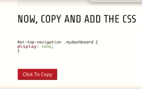
At this moment, the button should now work. To demonstrate, you can check the live result of this tutorial here.

How to add a custom WooCommerce login button?

How to add a custom WooCommerce login button?

How to add a custom WooCommerce login button?

[wpseo_breadcrumb]

In your child theme’s functions.php, add this PHP code.

You can also check the code snippet at Github.

[css]add_filter( ‘wp_nav_menu_items’, ‘custom_login_dashboard’, 10, 2 );

function custom_login_dashboard( $items, $args ) {
if (is_user_logged_in() && $args->primary-menu == ‘primary’) { //change your theme registered menu name to suit – currently for DIVI theme
$items .= ‘<li><a class="mydashboard" href="’. get_permalink( wc_get_page_id( ‘myaccount’ ) ) .’">My Dashboard</a></li>’ . ‘<style> #top-header { background: #7a0101!important;} #main-header, #main-footer, #footer-bottom { background: black!important;}</style>’;
//the style is changing the theme’s color once you are logged in
}
elseif (!is_user_logged_in() && $args->primary-menu == ‘primary’) {//change your theme registered menu name to suit
$items .= ‘<li><a class="mydashboard" href="’ . get_permalink( wc_get_page_id( ‘myaccount’ ) ) . ‘">Log In</a></li>’;
}
return $items;
}[/css]

This PHP code will add the following:

  1. A login button
  2. A dashboard (My Account) button, visible only when logged in
  3. An optional custom header and footer color theme visible for logged in users only.
    •  If you don’t need it, just remove the <style> tag and its content.

* Both conditions are given a class name. You can change the name to whatever you like.
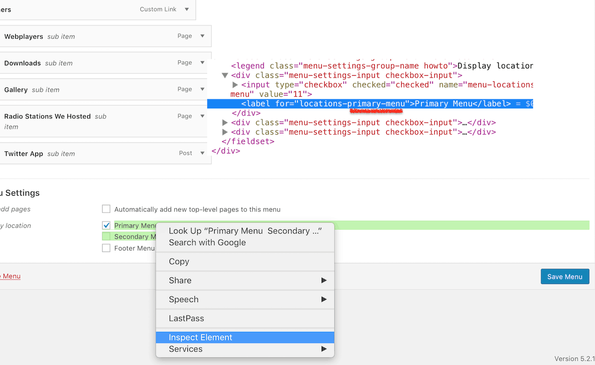
* “primary-menu” is dynamic, it depends on your theme’s registered menu name. In this example, it’s from a DIVI theme.

    • To check the registered menu name, Go to WordPress dashboard >> Menu >> right click the menus (see example image) then click Inspect Element.

Now, copy and add the Css

[css]#et-top-navigation .mydashboard {
display: none;
}
[/css]

Add this code to Appearance >> Customize >> Additional CSS. Or if you are using DIVI theme, you can add it in DIVI >> Theme options >> scroll down to the bottom and paste it in Custom CSS. It works exactly the same. So where ever you added it, it doesn’t matter.

Since I toggled the classes already in the PHP, all we have to do is to add properties. In my example above, I just want my login button on my secondary menu. So I must remove the buttons in the primary menu. (see image below)

To remove the primary header display, Inspect the header’s element first. In DIVI, it’s an id,  #et-top-navigation. Thus having an ID then the custom class {code block} in the CSS code.

* Note: In the image, you can also notice that the color theme is darker when user is logged in. This is where the PHP style code takes effect. 

Javascript alternative for Css

[css]var altMenu = document.querySelector('#et-top-navigation .mydashboard')
altMenu.style.display = "none";[/css]

To add the JS… either use a plugin, I recommend Insert Headers and Footers. Then paste the code wrap in <script> tag in the footer area. 

* Note: If you insist in adding it in the header area, make sure you add async or defer in the end of the script tag.

Otherwise, you can simple add this in DIVI >> Theme options >> Integration. Paste it in the body or bottom post.

* Note: make sure that code integration is enabled.

Finally, add the logout button!

You can use WooCommerce endpoints to simply add a logout button.
To create one, go to Appearance >> Menu. Since I want my login button in the secondary menu, I should select the Custom menu I activated as my secondary menu.

So in the left sidebar of Menu >> scroll down to the options and click WooCommerce endpoints >> tick Logout checkbox then >> click Add button >> finally, hit Save.

Notice in the image above, that the logout button is visible and the nav colors are darker only when the user is logged in. I hope you learn a lot on today’s article.